
Expanded File Support
In the realm of digital asset management, we were the outlier when it came to file support because we originally only support image and video files. Comparing to our competitors like Webdam, Flight, Box, Dropbox, and Bynder, PhotoShelter saw the opportunity to stay competitive and offer a much-needed feature to our clients.
We need to support more file types to make Libris more competitive in the market by allowing users to keep project assets together. Current users have to split up visual media (images and video) from other files (word docs, audio, etc), creating disjointed management experience. More files in Libris would also increase the number of stakeholders who interact with it, boosting product stickiness.
We want to be an solution for ingesting digital content and distributing. To support more file types means fewer sales deal breakers, it will also position us more competitively in saturated market.
Reasons to have this feature
We need to support more file types to make Libris more competitive in the market by allowing users to keep project assets together
Current users have to split up visual media (images and video) from other files (word docs, audio, etc), creating disjointed management experience.
More files in Libris would also increase the number of stakeholders who interact with it, boosting product stickiness.
We want to be an solution for ingesting digital content and distributing. To support more file types means fewer sales deal breakers, it will also position us more competitively in saturated market.
My Role
I led the design of the Expanded File Support. Collaborating with director of UX, sales, customer support, and engineers to build visuals to illustrate different file types that Libris supports. This project was launched globally on November 23, 2016.
Investigating Expanded File Support
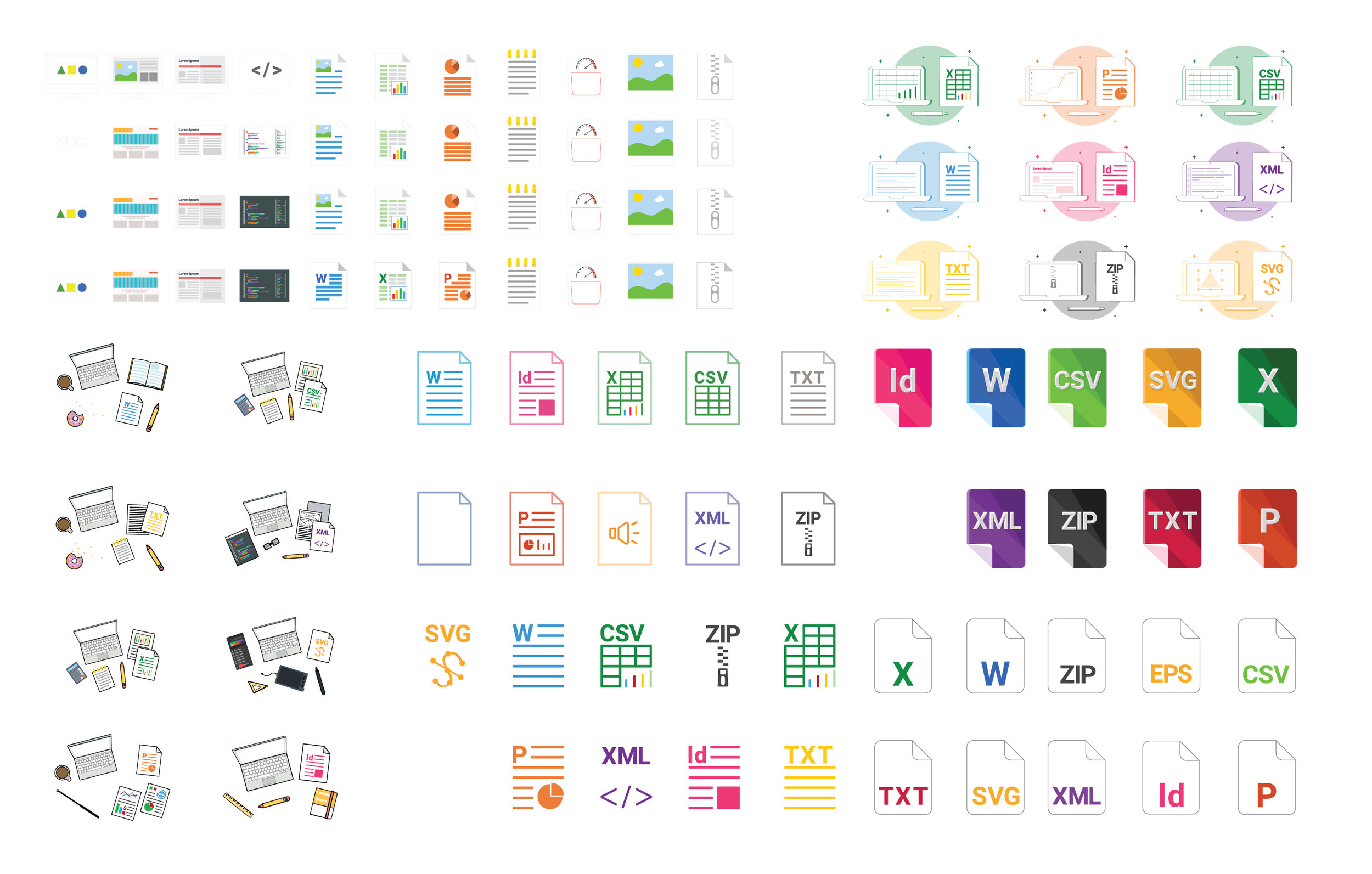
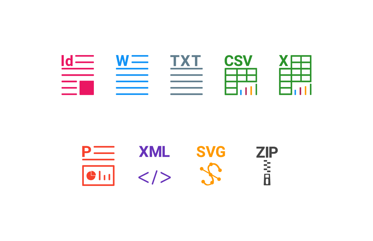
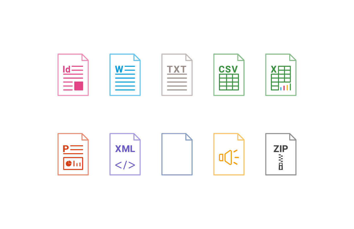
We first analyzed what are the top black box files (file types we do not support) being requested by our users the most. We then proceed to execute iconography design and single file view illustrations that best represent the file type that is not being supported.
Process
We utilized lean UX and iterative design. Unlike traditional form of design, in lean UX and iterative design we shouldn't expect to get everything right on the first try. Starting off from a minimal viable product will allow us to continuously integrate both internal and external feedbacks. Iterative design requires greater collaboration with the entire team (developers, product owner, stakeholders). The objective of lean UX is to obtain feedback at an earlier stage so decisions can be made quicker throughout the design process/prototyping.

First Iteration
After the first iteration of design we did two internal moderated testing. First internal testing was a black and white iconography testing. The thinking behind this was for accessibility purpose. We wanted to make sure that if the iconography were monochromatic, people with visual impairment could easily see. This was our early stage of accessibility exploration.
Questions
Do people understand what the icons stand for without the text explanation below (2.5)
Are these icons too detailed, or are they missing key representation in each of them?
Current designs are trying to avoid the direction of using words in them, but does it need words on the bottom of each icons to clarify them?
How well do the icons balance between our brand and our organization’s brand?
Are these icons too small? Too big?
When browsing, do people expect the files to be sorted by filename? Or by file type?
Main take away
Icons with the full extension (i.e. “SVG,” “TXT”) were the most recognizable
2 out of 5 testers didn’t understand the “P” icon
Taking account these first round take-aways and questions, we made more adjustments to the iconography, hoping it will have better recognition. In the second round of internal testing we narrowed down our question a little more:
Second Iteration
Questions
Is there increased clarity when color is presented? Does color add any confusion?
How well do the icons balance between our brand and our organization’s brand?
Main take away
From the feedbacks we received, testers mainly thought these iconography could be more recognizable with its original brand color.
Third and Final Iteration
After two rounds of internal testing, we were comfortable enough to bring the test externally. We used a platform called Validately, which allowed us to secure 6 participant, and each of the participants were given tasks to complete so we could track the success rate and possible points to improve our design.
Questions
Was it intuitive enough to perform the task provided?
Do you have any suggestions for making the files easier to find?
We also gave our external testers tasks to complete. This allowed us to monitor their workflow.
Task 1
Within the "Freelance Contract Templates" Gallery, find the Microsoft Word version of the 2017 designer contract. Point to the file with your cursor.
Task 2
Within the "K&K Travel" Gallery, find the Microsoft PowerPoint presentation. Point to the file with your cursor.
Task 3
Within the "Luminance 2017" Gallery, find the Microsoft Excel vendor list. Point to the file with your cursor.
Main take away
From the external testing, we had nearly 100 percent success rate: users were able to identify which icon belongs to which file types.