
Accessibility and Pattern Library

The job title “User Interface” has evolved throughout the years. When I first found the passion for UX and UI design, I was deeply drawn to the information architect and the fact that I could organize things in a way that I could offer audience a cleaner and simpler web and app design to increase ease in navigation. But throughout the years I’ve realized that to be a good user interface and user experience designer is not JUST about making things easy to use and pretty for our eyes to look at-- it is to create an inclusive environment. featuring a system library that could be used repeatedly and is accessible for all users.
Pattern library is a frontend resource for an organization. The benefit of pattern library is that they are reusable designs and have been tested for cross platform compatibility. Having a pattern library also reassures that all design assets that has been produced by your organization is consistent and the design process are efficient.
To fully achieve accessibility standard is hard but it is never too late to start. People often argue that going AA or AAA could force one product to take on odd design, but knowing these constraints could open you up to a whole new audience and give you new ideas to make your product even better.

Color palette
This color palette comprises primary and accent colors that can be used for illustration or to develop your brand colors. They’ve been designed to work harmoniously with each other. The color palette starts with primary colors and fills in the spectrum to create a complete and usable palette for Android, Web, and iOS. Google suggests using the 500 colors as the primary colors in your app and the other colors as accents colors.
AAA or AA
The process of choosing triple A or double A is long, you need to choose color scheme that best match your brand color.

Raised buttons
Raised buttons are rectangular-shaped buttons.
They may be used in dialogs, toolbars, or inline.When pressed border will appear to indicate pressed.
Border buttons
Border buttons are normally used as a secondary buttons.
They may be used in dialogs, toolbars, or inline.
When pressed border will appear to indicate pressed.
Button states
Button isn’t a one-state object. It’s multi-state. And providing a visual feedback to the users to indicate current button state should be a top priority task. Clearly identifying different states in button design will help all users.
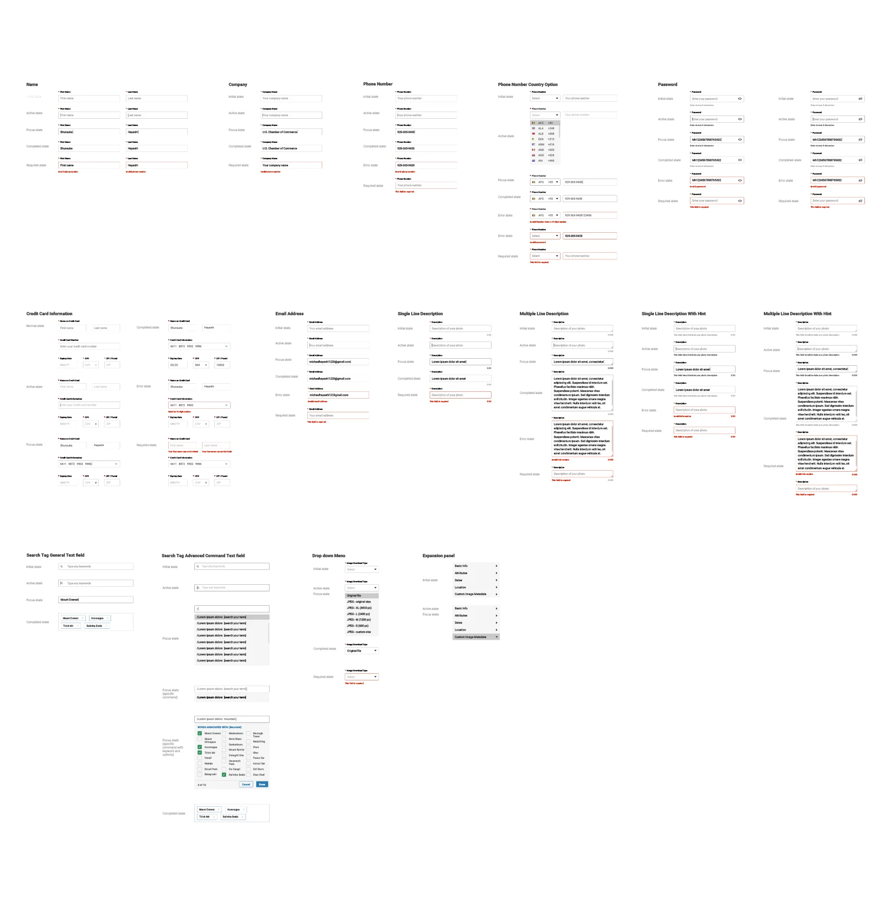
Text Input
In this set of designs you will see name field, company field, phone number field, password field, credit card field, email field, description field, search field, drop down menus, and expansion panel. Each section has five different state, initial, active, focus, completed, and error state.
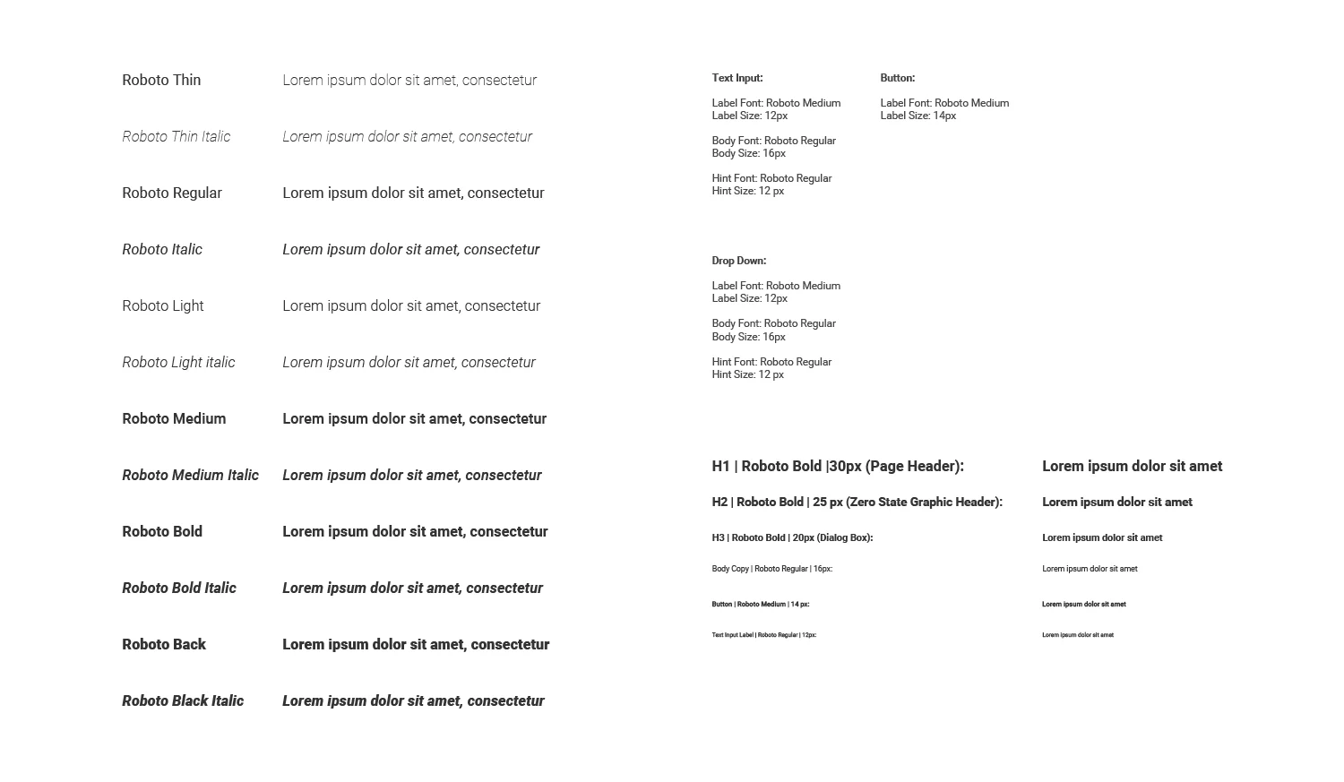
Roboto
Roboto has been refined extensively to work across the wider set of supported platforms. It is slightly wider and rounder, giving it greater clarity and making it more optimistic.
Roboto font weights
Roboto has six weights: Thin, Light, Regular, Medium, Bold, and Black.

Empty states and icons:
Empty states graphic are shown when items can not be displayed
Empty state is often under utilized or forgotten, but flat illustration has made its way into our daily lives. The usage of empty state graphics can potentially teach people how to use your product and drive engagement between your product and users. First impression needs to be a lasting impact, and with that in mind you will have a well designed user interface. Furthermore, in order to retain users, you need to make their experience more interesting. A good empty state addresses the what, where, and when. What will explain the content going in that section, where will tell the user which part of the product they are in, and when will explain to the user what actions need to be taken in order for data to exist on the screen. I have been actively developing a few empty state graphics to help our users during the on boarding process while ensuring the experience is interesting and engaging.
When designing a empty state include a tagline that:
Has a positive tone
Is consistent with your brand
Conveys the purpose of the app without appearing to be actionable