
Overview
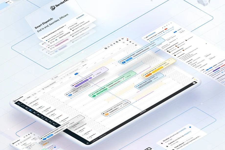
The Dispatch Board is where operations teams assign, track, and manage jobs in real time. It’s how home and commercial service companies keep every technician on schedule, and for a dispatcher it’s open all day, every day. The legacy board worked, but it showed its age: performance slowed down with large datasets, layouts were rigid, and the experience felt dated.
The pressure came from both ends of the customer base. Smaller shops wanted something simple and focused. Growing, multi-location businesses were running into the board’s limits: few filters, limited customization, hard navigation with dozens of technicians, and little information available at a glance. My redesign set out to modernize the interface, improve performance, and give dispatchers more efficiency and control without making the board harder to learn.
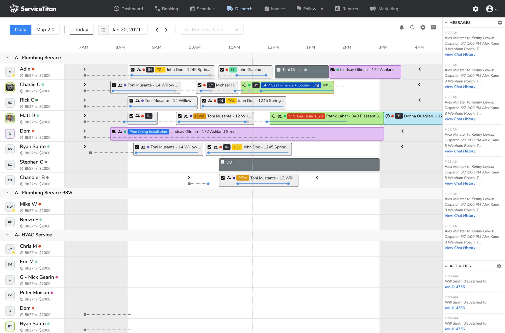
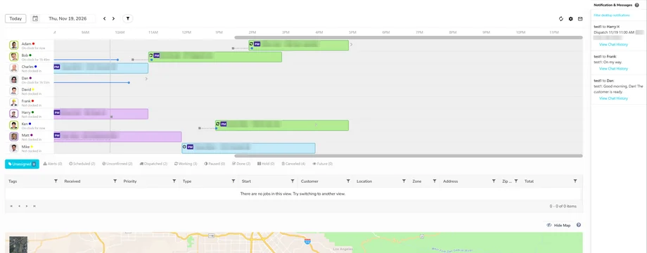
Before: the legacy Dispatch Board. The redesigned board is shown at the top of this page.
Before: the old board
Components of the Redesign
The redesign wasn’t one big release. It was a set of connected improvements, each solving a specific problem dispatchers had. Four goals ran through all of them: scale (fast with large datasets and many users), flexibility (configurable to different ways of working), intuitive navigation (clear wayfinding and information architecture), and actionable insight (the right information visible at a glance).
- Performance: optimized data loading and UI rendering so interactions feel instant.
- Holding Area: a visual staging zone for unassigned jobs.
- Accessible job assignment: click-and-drop alongside drag-and-drop, with clear visual cues and error prevention.
- Board views: horizontal, vertical, and weekly views that fit different businesses.
- Customization and context: dispatcher preferences, dynamic status, and panels that keep everything on the board.
- Enterprise scale: workstreams, richer filters, and a phased roadmap shaped with a large enterprise customer.
Holding Area: A Home for Unassigned Jobs
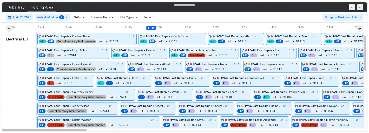
Dispatchers had no visual way to manage unassigned jobs on the board. Every unassigned job lived only in the Jobs Tray, a table below the board. It worked for looking up a job, but it gave no sense of where that job sat in the day, and new users often missed it entirely.
So customers improvised. Many created dummy technicians or fake teams just to make waiting jobs appear near the techs who might eventually take them. The workaround cluttered technician views, distorted reporting, and, worst of all, burned real money on managed tech licenses for people who didn’t exist.
The Holding Area replaces that workaround with a modular panel that sits right next to the board. Unassigned jobs appear on the same timeline as everything else, and dispatchers can group and filter them by status, priority, location, skills, business unit, job type, and zone. Together with the Jobs Tray, it’s the go-to place for unassigned jobs, urgent reschedules, and conflicts, and it delivers immediate cost savings by removing the need for dummy technicians.
Designing Assignment for Everyone
Drag-and-drop is how most dispatchers assign work, and it’s usually treated as the friendly, intuitive option. Looking closer, it is also one of the least accessible interactions on the board. Keyboard-only users can’t perform the precise pointer movement it requires. People with tremors or limited dexterity struggle to hold a button down while moving an item. Many screen readers and alternative input devices barely support dragging. And for users with cognitive disabilities, the multi-step mechanics can be confusing. In each case, the result is the same: someone is locked out of the board’s core task.
WCAG 2.2 is clear that when dragging isn’t essential, there has to be another way to do the same thing. I studied how other products handled draggable content, then designed a click-and-drop model for the board. A dispatcher selects a job with a mouse, keyboard, or assistive device, then chooses its destination with a second click, keypress, or tap. No simultaneous movement and selection required. Drag-and-drop is still there for people who like it, now with clearer visual cues and error prevention, and both paths end in the same assignment.
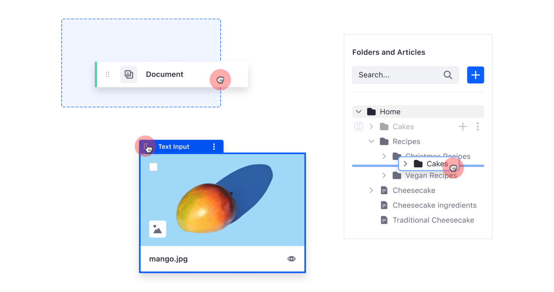
Drag-and-drop reference patterns from Liferay products.
Board Views That Fit the Business
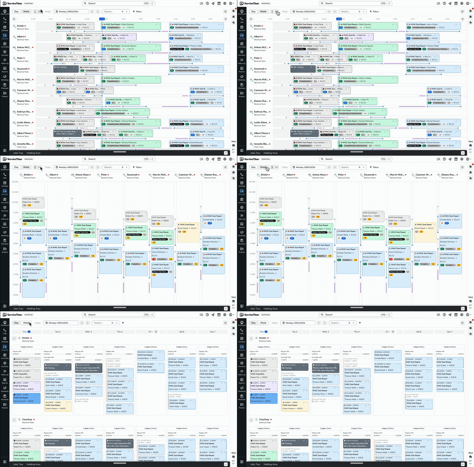
There isn’t one right way to look at a day of dispatching. A small business with a handful of technicians benefits from a simple, focused view, while a larger tenant needs a layout that keeps scaling as rows of technicians are added. I designed toggle controls for switching between horizontal and vertical daily views, keeping the layout consistent and responsive across both orientations, and tailored the views to the different needs of smaller and larger tenants.
I also designed a new weekly board view. It gives dispatchers a clear overview of jobs spanning several days, which is especially useful for multi-day work like excavation, where seeing the whole timeline across the week matters more than any single hour.
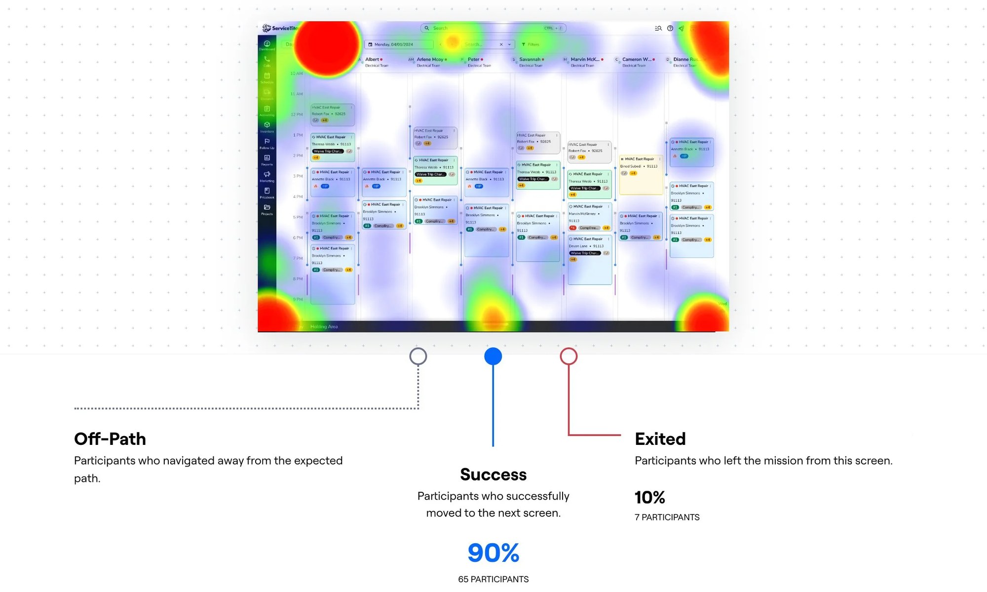
Because the view toggles were brand new, we tested them in an unmoderated usability study with 75 participants. 65 completed the task successfully on their first attempt (90%), while 7 left the task from this screen (10%). The heat map looked scattered, which made sense: several toggle-style buttons on the new UI could reasonably be mistaken for the board-view control. With a success rate that high, the change didn’t need rework, but it pointed to where clearer visual hierarchy between controls would help.
Customization, Status, and Context
Dispatchers kept telling us the same thing in different ways: the board needed to match how their team actually works. The Dispatcher Preferences panel lets each person decide what a job bubble shows (job type or project name, customer or location name, street address, city, or zip code, and whether tags appear), switch between compact and expanded team display, and set defaults like side-panel width and saved filters. Changes apply only to their own account, so one dispatcher’s setup never surprises another.
The Jobs Tray became configurable too. Dispatchers can add custom fields, choose and reorder columns, see customer type, spot rescheduled jobs, and read tags more easily. On the board itself, a dynamic status system makes progress readable at a glance. Job bubble colors and icons show whether work is scheduled, confirmed, dispatched, on hold, in progress, or completed. Technicians show a status under their names, with counts of how many are idle, dispatched, or working. Lines for drive time, predicted drive time, and working time sync with shifts, which helps prevent overbooking past shift boundaries and reduces fatigue-related driving risk.
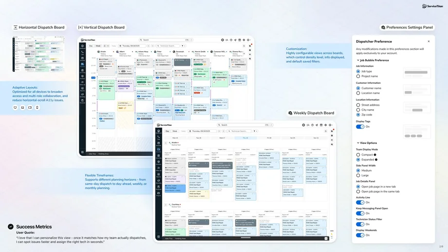
One board, three views. Each dispatcher tunes layout, timeframe, and what a job bubble shows in their own preferences.
The last piece was keeping dispatchers on the board. A Job Details flyout shows full job context without navigating away. How much detail belonged in a quick popover versus the full flyout was one of the questions we put directly to dispatchers in the Jobs Tray feedback session. An activity feed brings urgent issues that need human judgment to the surface, with read and unread states. Messaging between dispatchers and the field keeps everyone accountable, and messages can be attached directly to a technician’s current job. A mobile version of the board gives dispatchers visibility and faster technician contact on the go, and the same threads reach technicians in their own app.
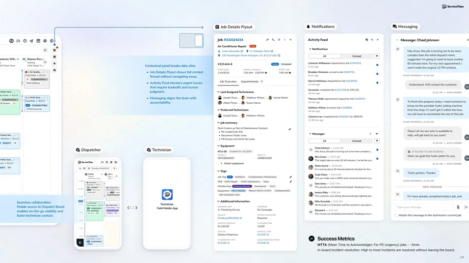
Job details, the activity feed, and messaging all open beside the board, and carry over to the dispatcher’s phone and the technician app.
Scaling Up With an Enterprise Partner
One component was planned with a large enterprise plumbing franchise as a design partner. For an organization that size, every one of the board’s limits was multiplied. I shared the work with them as a review of the current experience, the goals behind each improvement, and a phased plan, so their feedback could shape it before and during delivery.
The first phase, planned for 30 days, focused on the new board itself: multiple view options, technician search, a persistent Jobs Tray, the Holding Area, a collapsible activity center, and dispatcher preferences. The second phase, over the following 90 days, focused on scale. Workstreams let a dispatcher build a view from business units, zones, dispatchers, and teams, then choose which workstreams to focus on each morning. New filters for technician status and shift helped dispatchers narrow the board further, and status counts showed availability across the whole team at once. After that, the plan moved into ongoing monitoring and improvement.
Research & Validation
The work was shaped with customers rather than in isolation. Reviewing how large, multi-location operations used the board showed where navigation, filtering, and scanning broke down with many technicians and dispatchers. Walking the enterprise partner through the designs turned presentations into working feedback sessions, and their reactions directly refined workstreams, filters, and preferences around how their dispatchers actually split up work. Accessibility guidance (WCAG 2.2) set the bar for assignment interactions, and the 75-person usability study validated the new board-view controls before launch.
The Jobs Tray on the weekly board got its own prototype-based feedback session. Dispatchers, CSRs, and managers or owners worked through three clickable prototypes, then answered a short survey after each task. They rated the Jobs Tray’s design and discoverability, then assigned the first unassigned job to a technician. Next, they opened the details popover on an alerted job to check whether its job summary, tags, and alert information were easy to reach. Finally, they compared finding the same job summary in a quick popover and in the full Job Edit Flyout. Each 1–5 ease rating was paired with an open question asking people to explain their score, along with prompts like “Was there any information within the popover that you find unnecessary or missing?” The session closed by asking which they’d prefer for viewing more information about a job appointment: the popover or the flyout.
Outcomes
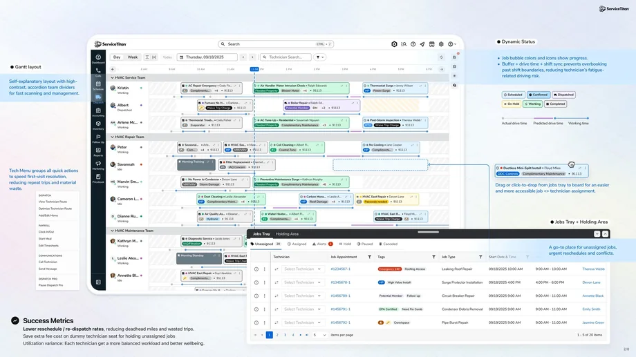
The final board: a Gantt timeline with live status, a quick-action Tech Menu, and the Jobs Tray and Holding Area docked below for drag-and-drop assignment.
The redesign was measured against outcomes that matter to a service business, not just usability:
- Lower reschedule and re-dispatch rates, reducing deadhead miles and wasted trips.
- No more paying for dummy technicians: the Holding Area removes the extra seat fees customers paid just to park unassigned jobs.
- More balanced utilization, so each technician gets a fairer workload and better wellbeing.
- Mean time to acknowledge urgent (P0) jobs of about 5 minutes, with most incidents resolved without leaving the board.
- 90% first-attempt success (65 of 75 participants) on the new board-view controls.
One dispatcher summed up the customization work: “I love that I can personalize this view. Once it matches how my team actually dispatches, I can spot issues faster and assign the right tech in seconds.”
Reflections
Designing for the largest customers forces clarity. Problems that are minor annoyances for a small team, like scrolling to find a technician or scanning for unassigned jobs, become real operational costs at enterprise scale. The dummy-technician workaround was the clearest example: when customers pay for licenses just to work around your UI, the design problem is also a business problem.
The accessibility work changed how I think about “intuitive” interactions. Drag-and-drop feels natural to many people and impossible to others, and designing an equal alternative made assignment clearer for everyone. Across the project, the lesson was to build flexible building blocks, like workstreams, preferences, and views, instead of one-off custom solutions, so improvements made for one customer help every dispatcher.