Blog

Actionable v.s. Unactionable

“Embrace all analytics” may sound like a whole lot. When walking down the path of UX you will get feedback. Usually, you get two kinds of feedback, actionable and unactionable. So how do we differentiate one from another?

As a designer, I am sure you hear feedback like “This is fantastic! Very easy to use” or “This is very complex, I wouldn’t recommend anyone using it” or anything along these lines. I bet it made you feel great or angry, didn’t it? I know I did when I first started off my career, and these are what I call unactionable feedback.

Unactionable feedback can feel like hitting a wall, but it gives us an opportunity to dig deeper. This feedback is most likely what users felt compelled answering, but are not why they actually feel the way they do. Feedback like “This is fantastic! Very easy to use” or “This is very complex, I wouldn’t recommend anyone using it” can get lost in translation because of lack of information provided.

simple.png

On the other hand, to get actionable feedback we have to start asking “WHY”. In return we get insight into the root of their likes or dislikes towards a design.

complex.png

This is similar to quantitative and qualitative surveys. While quantitative surveys have a scaled rating system such as numbers and star ratings, qualitative surveys are a method used to gain in-depth information and underlying reasoning. A great example of this is free-form feedback.

When addressing these surveys, there are couple of ways to get the qualitative, also referred to as the “WHY”. You can conduct interviews, use an interactive prototype for a live demo, or you can also utilize tools like Fullstory. Most industry professionals are familiar with traditional an interactive prototype and interviews, however, I found using a non-traditional method such as Fullstory can help you understand user interaction better. Fullstory is an app that captures all your customer experience data into one powerful, easy-to-use platform. As Justin Owings said “You can search the entire catalog of user behaviors on your site for just those that would affect whatever quantitative data you're researching,” rightly pointing out how Fullstory interaction recording could help designers and researchers understand how their target audience is behaving with their products.

Mobile.png

A good exercise I recently picked up was the STAR technique. S- the situation, T- task you’re targeting, A- the actions needed to complete the task, and R- the result. From experience, the STAR technique provides me the vantage point to think about the design I’d like to create, the audience I am designing for, the function my design ought to include, and the purpose of it all. So while asking the “WHYS” you can really validate your hypothesis and design.

Screen Shot 2018-12-03 at 11.42.47 PM.png

To be curious or not to be curious can differentiate what kind of designer you will be. Curiosity and asking the right question is something I am still developing. It is something that will take time and practice, but stand in your users shoes and try to ask questions through their perspective.

Thumb Zone

It's the age of mobile, and more advanced technology has become the less effort we want to do to interact with an application. I've been doing quite some traveling these days and I tried on different ride-sharing applications. What I noticed through this exercise are their business offering and their product experience decisions.

thumb-zone-mapping-opt.png

First thing I want to talk about is search bar. 

A search bar is an ubiquitous element in any web application or mobile application. It helps users gather information they are looking for, and find the right content.

Positioning.

Where is the best optimal position for a search bar? It's certainly up for discussion. When it comes to different business strategy and needs a company can choose to put their search bar on top or bottom. But how do we design for mobile, so it's easy to just use thumbs to navigate through our day?

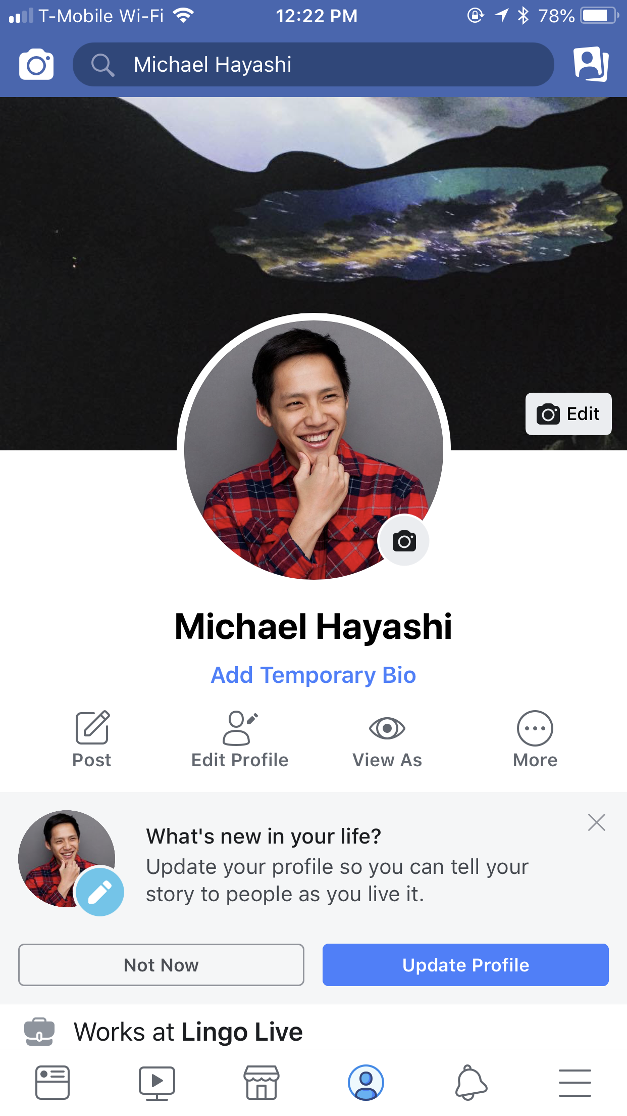
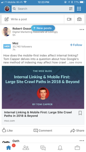
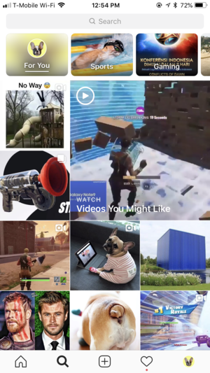
Facebook, Instagram, and Linkedin all practice search bar on the top. These social media platform wants you to focus heavily on the actual newsfeed and content that is being displayed in the "Stretch and natural" area of your thumbs. For example, the sole purpose of Facebook is to consume information in the most fashionable time. This scroll addiction social media has imprinted us is a curse and a blessing.  Sean Parker, the ex president of Facebook shared “How do we consume as much of your time and conscious attention as possible?”

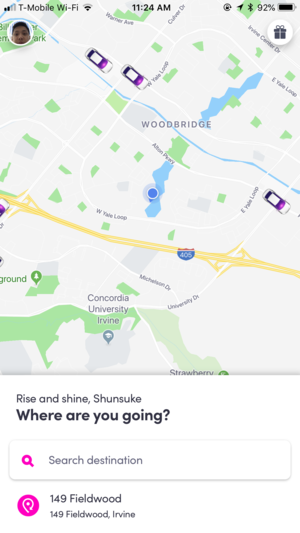
Lets takes step back and bring it back to ride sharing applications. Users who interact with these applications are there to search new address or update address to get more accurate location placement and better ride deals all the time. With this in mind, it’s optimal for ride sharing applications to put search bar on the bottom so it’s easily accessible by thumbs, so they are contained in “natural” area.

  1. Lyft introduces search bar on the bottom, and as you focus on to it it expands upwards filing the whole screen. The transition you get here is almost seamless and easy to digest.

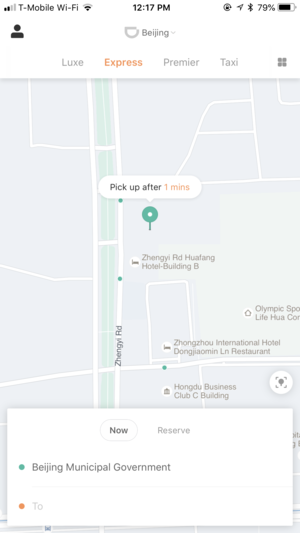
  2. Didi Chuxing is another example of search bar being on the bottom. The experience is almost identical due to their partnership.

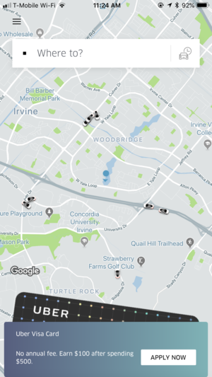
  3. So why did Uber choose to place their search bar on top? I have two theories.

    1. They are going through business strategical change. Where they want to offer loyalty programs upfront to their users.

    2. Users can expect a natural and familiar dropdown interaction once clicked on a search bar.

Summary

I prefer the search bar on the bottom. All in all the experience comes back to search bar being on the bottom. After something has been search you have to come back to ground zero to search for another result. Love to hear thoughts!

Reference Link

https://www.uxmatters.com/mt/archives/2013/02/how-do-users-really-hold-mobile-devices.php

Michael Hayashi Comment
Form Fields (Asterisk vs. Required)
UtQbD.png

My colleague recently shared an article on CSS-Tricks on Twitter that the red asterisks that are often associated with form elements to imply that they are required make users more fearful. And that it increases the risk of errors and reduces the form completion. For those who are not familiar, when you are filling out form fields there are usually labels on top of the field and for those fields that are required to fill out, they usually have a little red asterisk on the side to tell the users that they HAVE to fill it out.

https://twitter.com/css/status/1037327751705976833

and the link below is a supporting article on this argument. 

https://uxdesign.cc/form-field-required-vs-optional-9b4d7cdbf400

1_eHuk4BVjS9n_-9I8vbIVaA.jpg

I don't completely agree but I also do see the point that's being made here. As a user experience designer it is our duty to provide the users with the right tools and information so they can complete their task. In this case, it means we need to provide a label, placeholder text for examples, and hint text to support their process of filling out the information they need to complete.

The two approaches introduced in Medium article are both very interesting. The first is introducing field with the use of asterisk and the second one is suggesting to mark an optional field as "optional" and leave the required field as is with just its own label. Two downsides to the second approach are that after you submit a form and come back as the error it might throw off the user since it wasn't "labeled" as required, another downside is the indication of requirement.

Screen Shot 2018-09-05 at 10.18.15 AM.png

*Fearful to make an error means they aren’t provided with enough context to fill that field out. 

If a user is uncomfortable, feeling restricted that means they are scared of the outcome of the input field. They are scared that they will make an error because it does contain what the product wants a user to input. I personally have encountered the situation where when I create a password it keeps throwing me an error messaging, but I had no clue what I was doing wrong. Below is an example of password creation with proper hint messaging, as you hit individual criteria of password creation, it gives you a green light to tell you that you are doing something right.

The problem isn't the red shining asterisk, the problem is not explaining to the users how to fill out the field. If a field gets as complex as password creation users will need extensive hint and instruction.