Thumb Zone
It's the age of mobile, and more advanced technology has become the less effort we want to do to interact with an application. I've been doing quite some traveling these days and I tried on different ride-sharing applications. What I noticed through this exercise are their business offering and their product experience decisions.

First thing I want to talk about is search bar.
A search bar is an ubiquitous element in any web application or mobile application. It helps users gather information they are looking for, and find the right content.
Positioning.
Where is the best optimal position for a search bar? It's certainly up for discussion. When it comes to different business strategy and needs a company can choose to put their search bar on top or bottom. But how do we design for mobile, so it's easy to just use thumbs to navigate through our day?
Facebook, Instagram, and Linkedin all practice search bar on the top. These social media platform wants you to focus heavily on the actual newsfeed and content that is being displayed in the "Stretch and natural" area of your thumbs. For example, the sole purpose of Facebook is to consume information in the most fashionable time. This scroll addiction social media has imprinted us is a curse and a blessing. Sean Parker, the ex president of Facebook shared “How do we consume as much of your time and conscious attention as possible?”
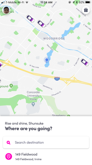
Lets takes step back and bring it back to ride sharing applications. Users who interact with these applications are there to search new address or update address to get more accurate location placement and better ride deals all the time. With this in mind, it’s optimal for ride sharing applications to put search bar on the bottom so it’s easily accessible by thumbs, so they are contained in “natural” area.
Lyft introduces search bar on the bottom, and as you focus on to it it expands upwards filing the whole screen. The transition you get here is almost seamless and easy to digest.
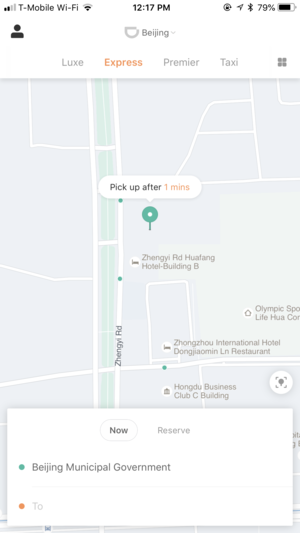
Didi Chuxing is another example of search bar being on the bottom. The experience is almost identical due to their partnership.
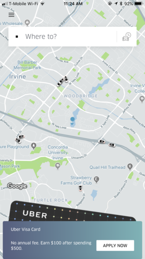
So why did Uber choose to place their search bar on top? I have two theories.
They are going through business strategical change. Where they want to offer loyalty programs upfront to their users.
Users can expect a natural and familiar dropdown interaction once clicked on a search bar.
Summary
I prefer the search bar on the bottom. All in all the experience comes back to search bar being on the bottom. After something has been search you have to come back to ground zero to search for another result. Love to hear thoughts!
Reference Link
https://www.uxmatters.com/mt/archives/2013/02/how-do-users-really-hold-mobile-devices.php