Refactoring PhotoShelter UX/UI
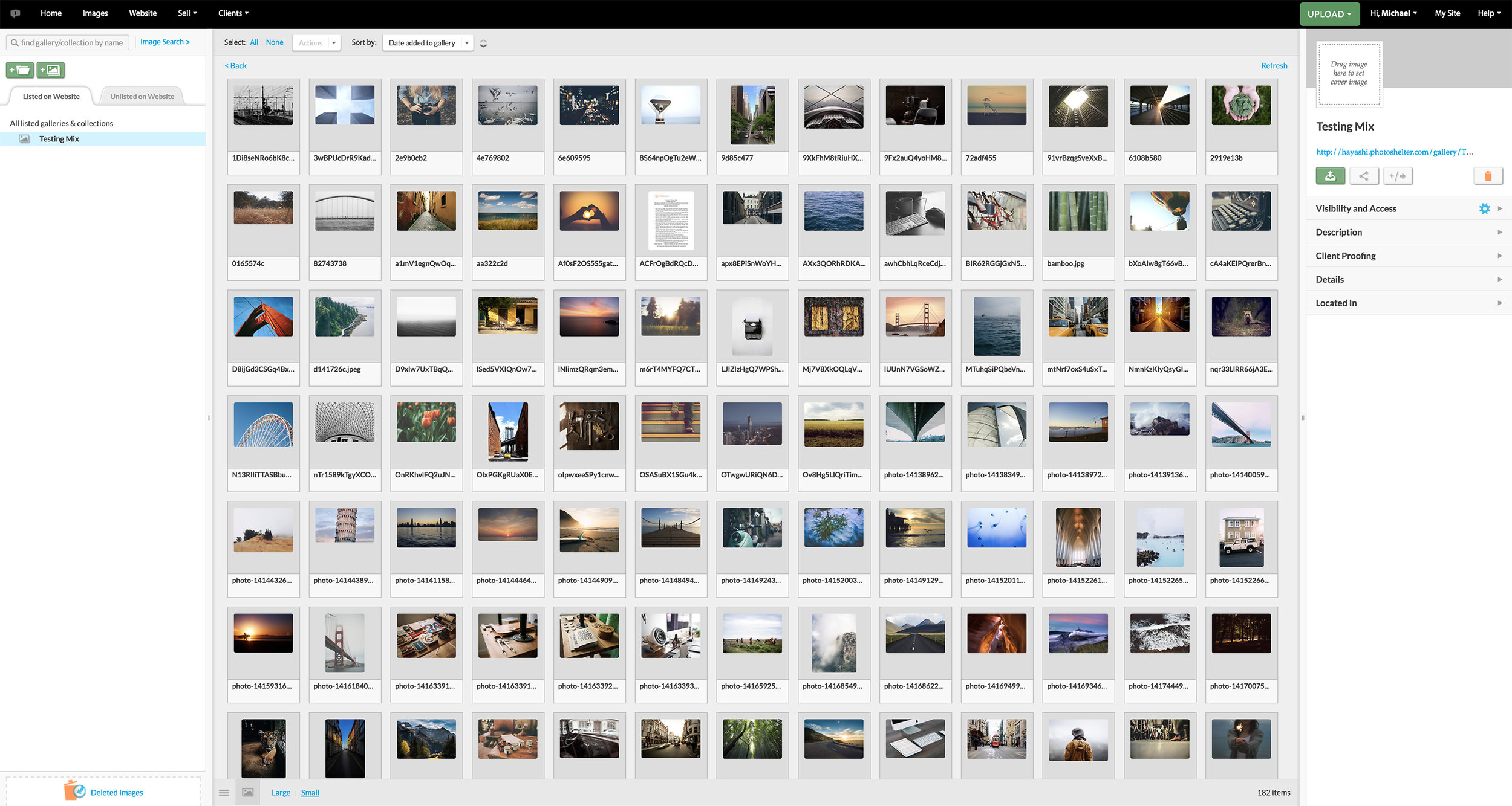
Design by Demand. Formed a decade ago, PhotoShelter has improved and changed itself to become one of the leading digital asset management companies to date. Advancements in technology and user needs have left the product lagging behind and in need of a refreshed approach to meet the challenges today.
To better help PhotoShelter, To better outline areas in which to improve, I purposely abandoned any pre-conceived notions around design and took a fresh look at the user interface. This allowed me to stop solving problems the “usual” way and approach the experience with a fresh perspective.
Investigation and discovery of Libris
First I self explored the product without customer service guidance. By doing so, I was able to obtain direct and honest first hand experience as a new user.
After my initial walkthrough, I wrote down all of my initial feedback and possible changes PhotoShelter product could use. Some of the more general overarching problems I noticed were outdated user interface design and poor information architecture. From these observations I noticed that PhotoShelter needed a more defined and clear user interface component repository.
Introduction to Pattern Library
Think of pattern library as a guidebook for all user interface design components. Once a company has reached a certain size and complexity, it is vital to keep the design consistent. As the digital space continues to evolve, we need to be developing thoughtful design systems. The atomic design methodology. Atoms are the basic building blocks of molecules. If you were to apply this methodology to user interface design, atoms would be color palettes, fonts, labels, input design, buttons, switch (essentially components to make up a user interface).
And molecules would be what we call dialog boxes, forms, and actual web pages. Essentially when you start combining all the components (atoms) they become molecules.
So creating these components and splitting them into atoms and molecules helps to keep the design consistent. A reusable element is much more time and cost efficient. This should be considered as the priority practice for all companies.
Here are common pattern categories
Navigation: Menus, breadcrumbs, footers, pagination and tags.
Selection: Choosing the best use of buttons, checkboxes, lists and toggles.
Search, Filtering and Sorting
Messaging and Notifications: Alerts, pop-ups, and progress bars.
Data: Whether it’s a big data set or a small one, display data efficiently.
Social: How can people connect, share message or interact?
Hypothesis
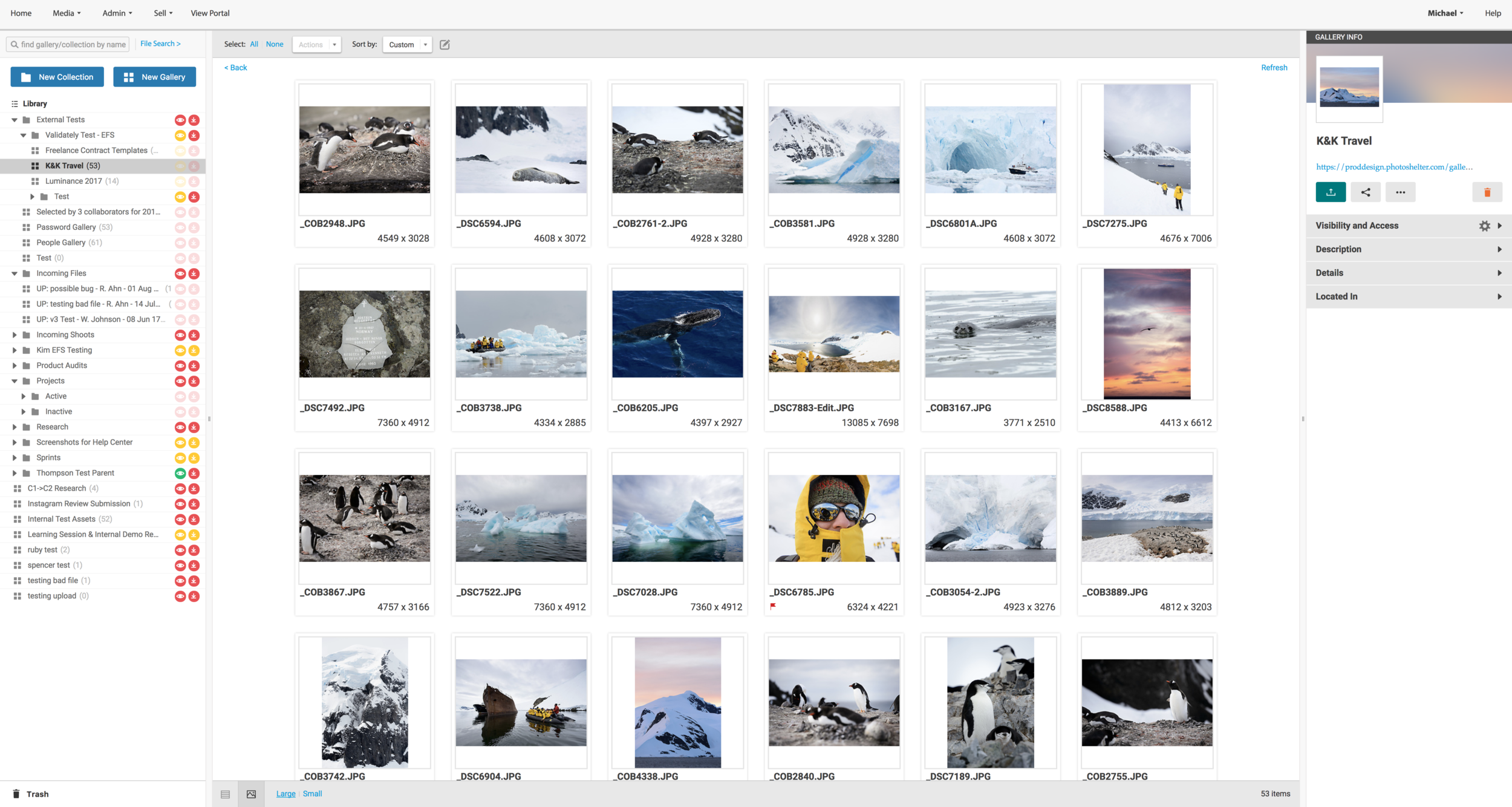
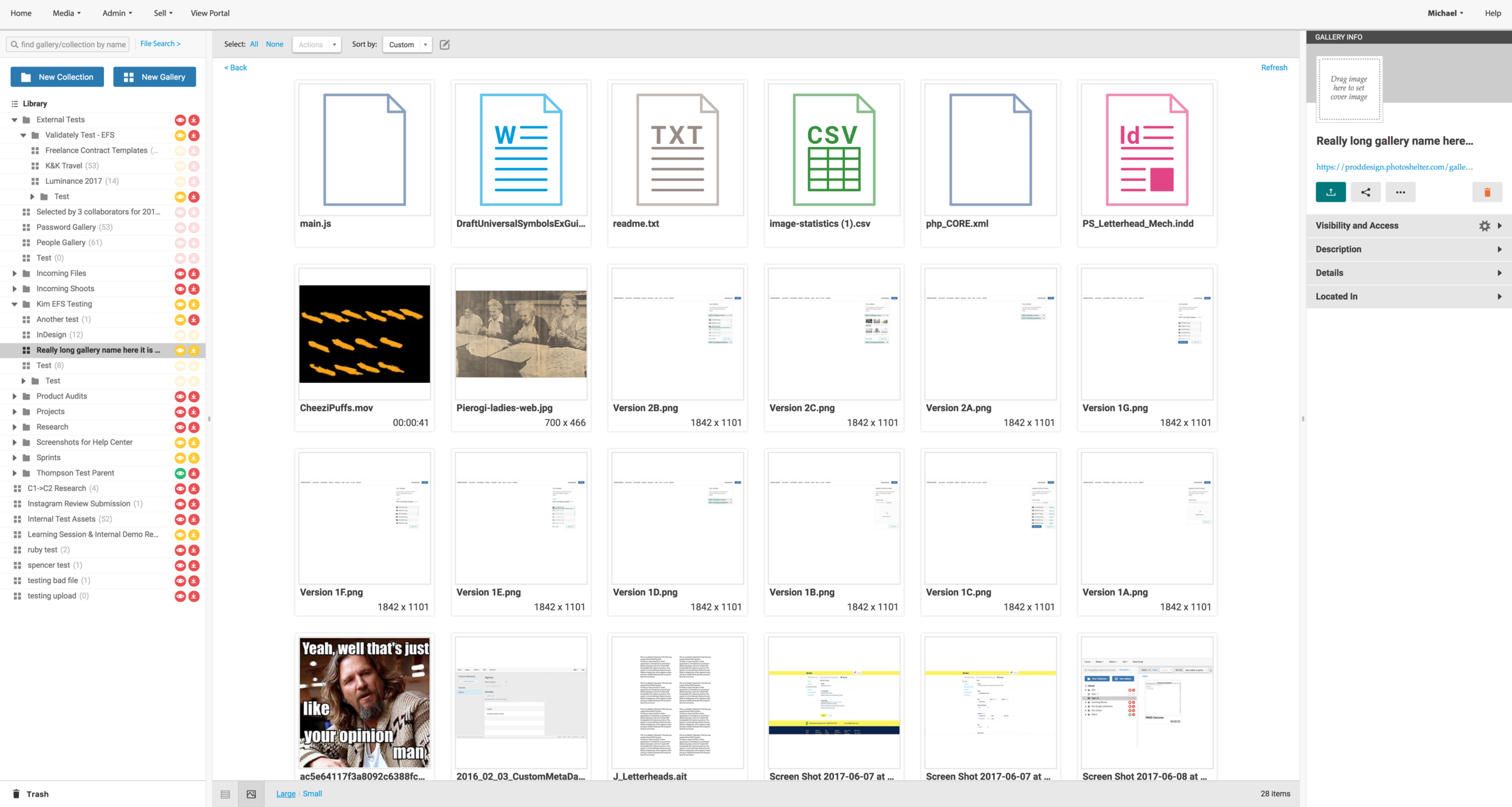
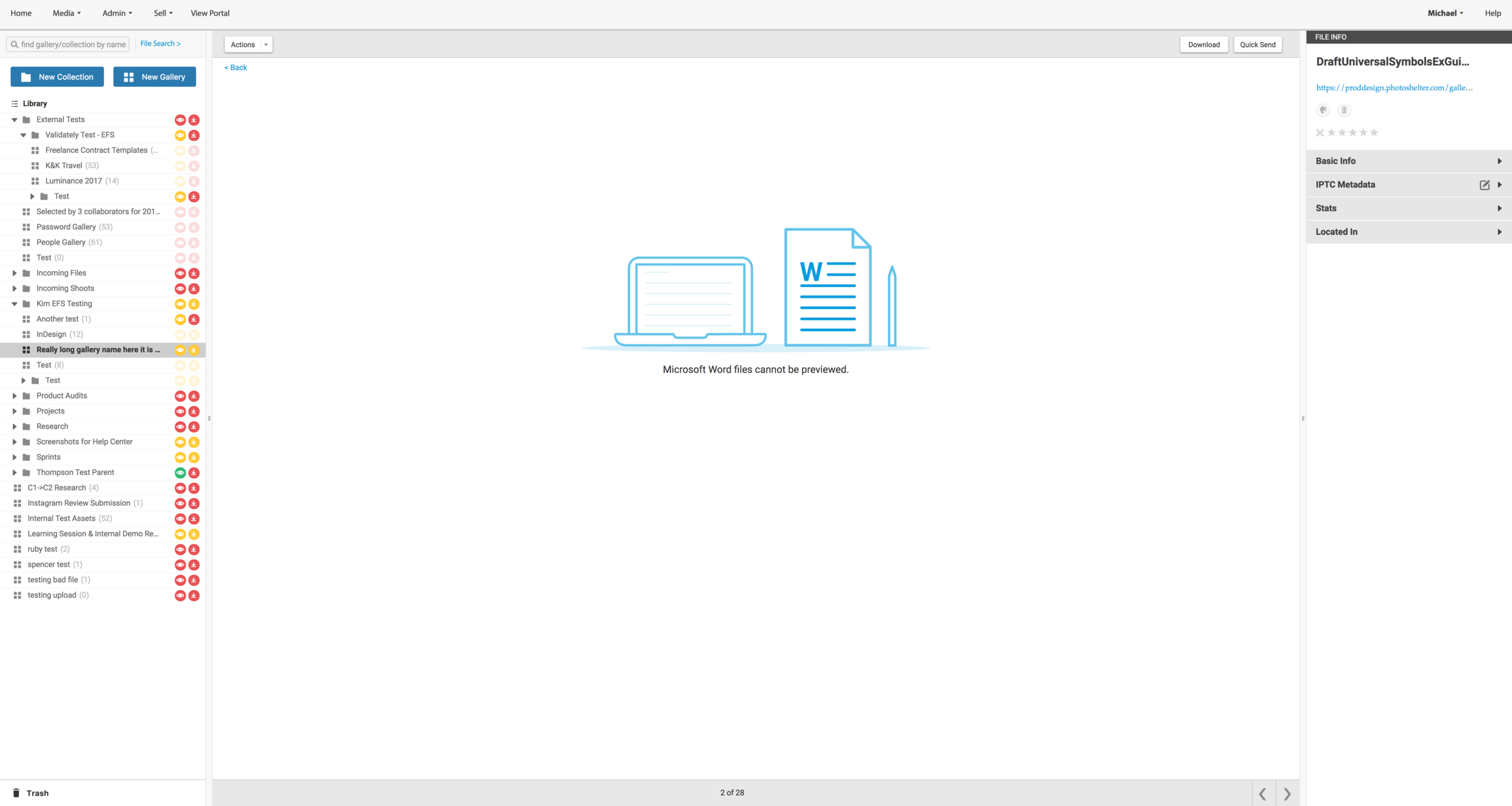
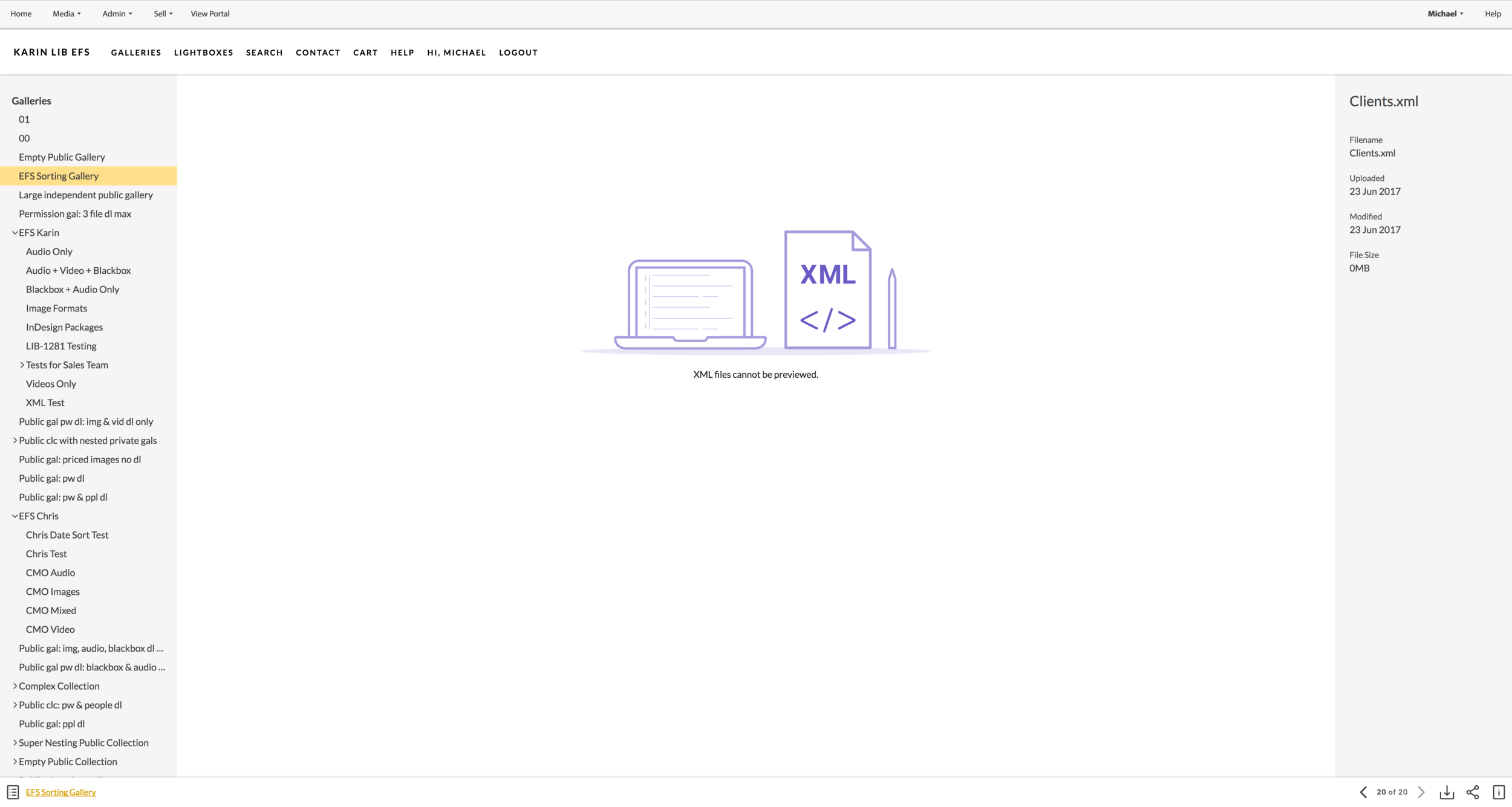
With the release of Expanded File Support, a feature that allowed us to accommodate all sorts of file types, we will be expecting an increase in user engagement due to a better user interface and the implementation of zero state graphics.
Refactoring of our product will also allow us to cut down unnecessary or unused features, which benefits our code base and help it stay clean.
Results
The result of Libris redesign showed improvement as I delved deeper into Google Analytics. With the official launch of EFS, analytics showed the bounce rate for our admin portal was significantly decreased by 14.48%. And for our public portal, unique pageviews increased by 30.59% and bounce rate was decreased to 11.52%. The reason behind the increase in unique pageviews is largely due to the fact that there is sufficient visual indication to bring in new customers while retaining existing users.

Portal GA Pageview Stats
Orange Line is tracking public portal stats from April 28 to July 2nd, and the blue line is tracking from June 9th to July 14th. For our public portal, unique page views increased by 30.59% and bounce rate was decreased to 11.52%.
Library(MU) GA Pageview Stats
Orange line is tracking from April 18th to June 2, and the blue line is tracking from June 9th to July 14th. With the official launch of EFS, analytics showed that page view increased by 7.94% and the bounce rate was significantly decreased by 14.48%.

